Air Monitoring Station Search Guidance
These are scenarios to guide new users through examples using the Air Monitoring Stations Search. We encourage you to follow these examples to become more familiar with the available search criteria and dynamic features on the results pages and report.
Scenario 1: Search by Monitored Risk Level Criteria
Question: Where have monitoring stations measured concentrations of a particular pollutant at or above a certain long-term cancer risk?
Search Criteria:
- Search Type: Hazardous Air Pollutants
- Timeframe: 2020
- Search Aggregate or Single Pollutant: Single Pollutant
- Pollutant Name: Benzene
- Average Long-Term Cancer Risk Level: >= 10 (people in a million)
- Set Non-Detects Equal To: Use Regression Method (default)
- Exclude Results with More Than 80% Non-Detects: Yes (default)
Results: 17 monitors (results counts are subject to change)
Next Steps: Results show where air monitoring stations have measured benzene at concentrations that exceed the long-term cancer risk level. A risk level of 10-in-one-million implies a likelihood that up to 10 people, out of one million equally exposed people would contract cancer if exposed continuously (24 hours per day) to the specific average concentration over 70 years (an assumed lifetime).
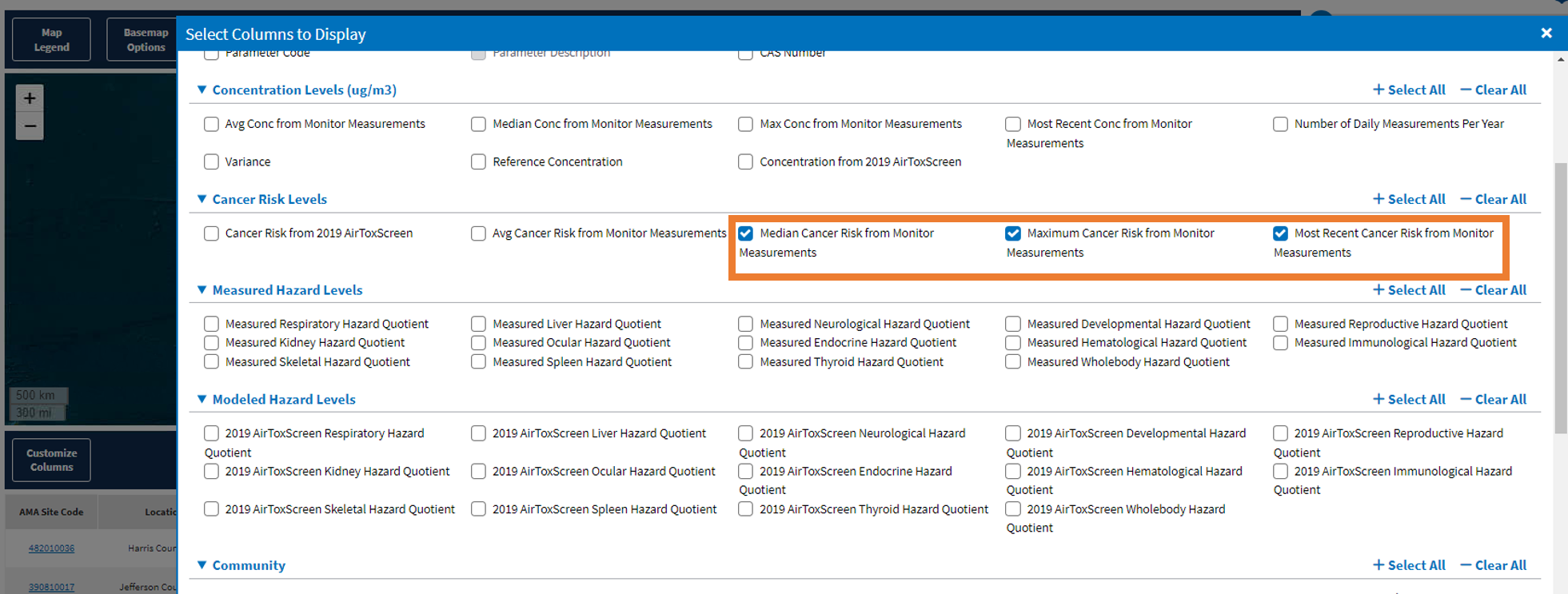
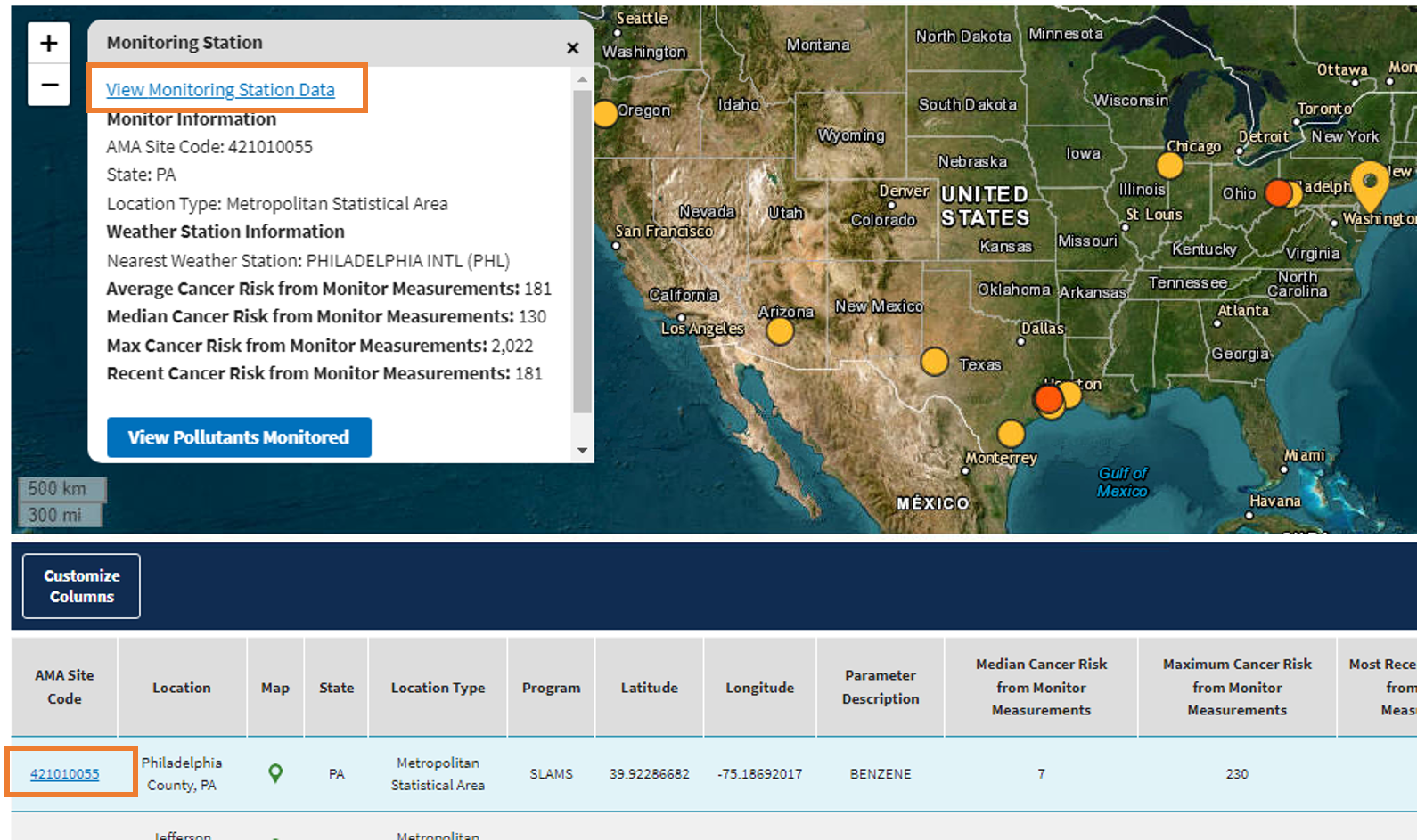
You may select additional columns from the Customize Columns above the results table. For example, add the median, maximum, and most recent year cancer risk from monitor measurements columns to the results table and compare their values.
Next, sort by most recent cancer risk from monitor measurements.
Select the row in the table to highlight it and bring up the monitoring station popup (AMA Site Code: 421010055)
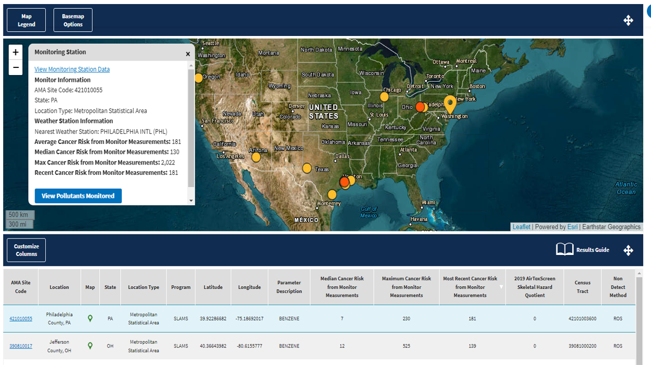
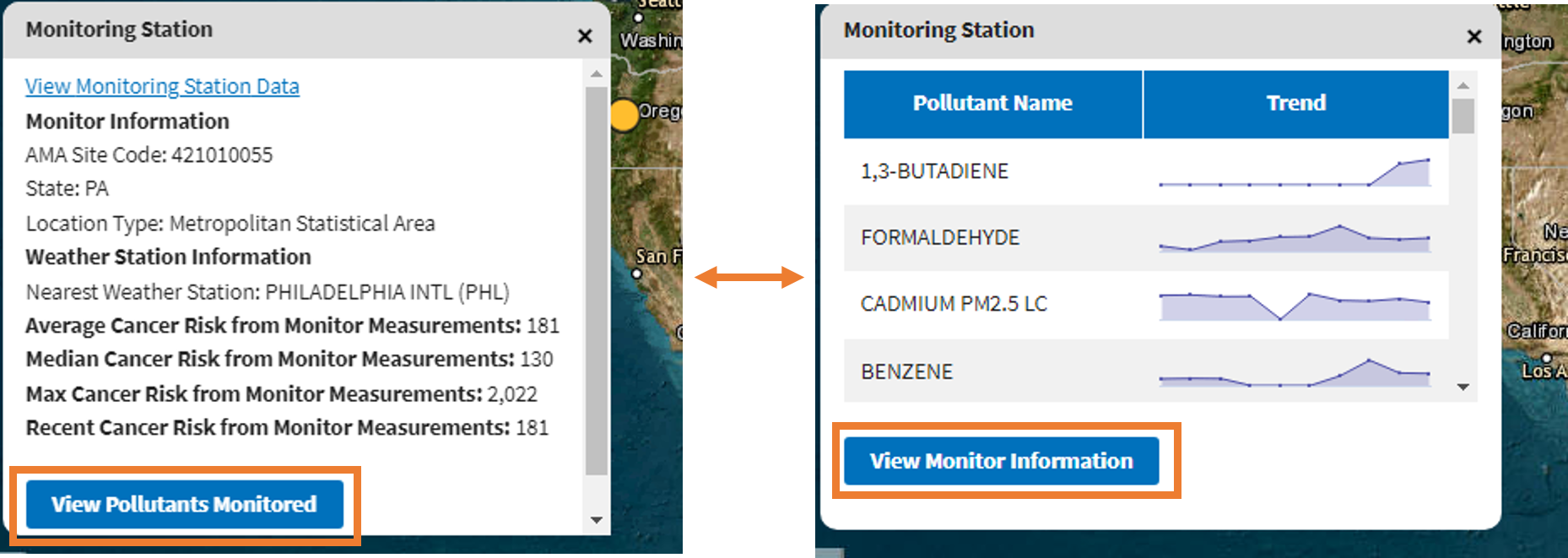
Select 'view pollutants monitored' to show you can see all the pollutants monitored at this site, and then 'view monitor information'.
In the results table/popup, you can select a hyperlink of a station in the AMA Site Code column to access the Air Monitoring Report.
Select 'Benzene' in the pollutants monitored table.
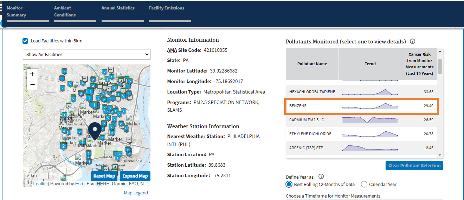
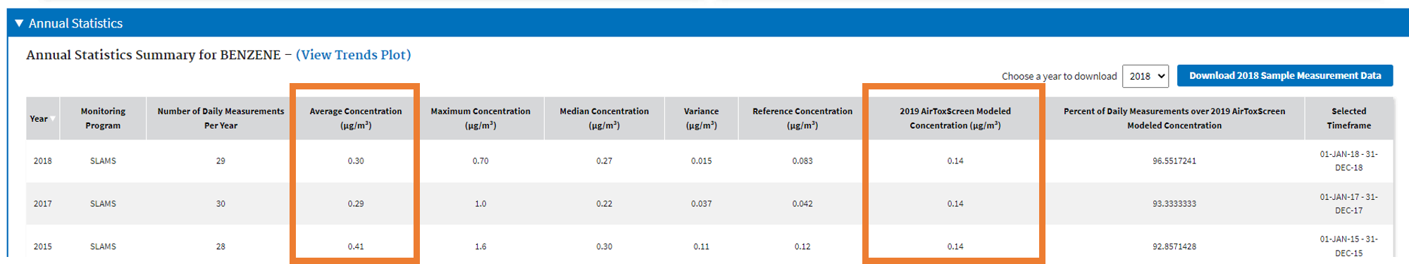
You can see more detailed information on benzene measurements at a station on this report.
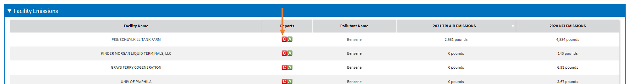
Scroll down to the facility emissions table. The facility emissions table links to the DFR.
Scenario 2: Search by Modeled Risk Screening Criteria
Question: What monitoring stations are located in areas above a certain cancer risk level, based on EPA's AirToxScreen model?
Search Criteria:
- Search Type: Hazardous Air Pollutants
- 2020 AirToxScreen Long-term Cancer Risk Level: Aggregate
- Cancer Risk: Total Cancer Risk >= 50
Results: 30 Monitors
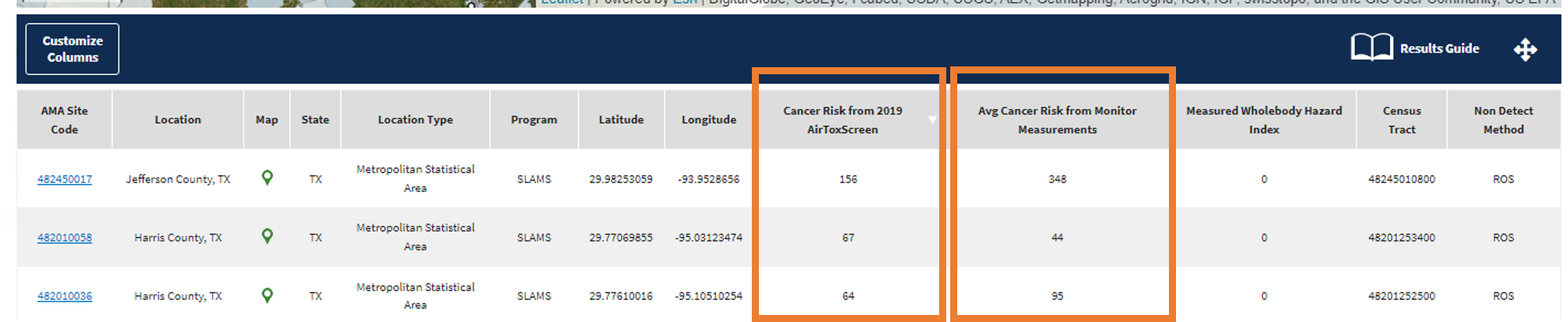
Next Steps: Results show monitors in areas that have an estimated long-time cancer risk, of at least 50 in a million people (based on modeled annual air pollutant concentrations). From Customize Columns, select 'Cancer Risk from 2020 AirToxScreen" column. Sort by this column to see the monitoring sites with the highest cancer risk.
Zoom the map to this cluster of monitors in southern Texas.
To understand the data and identify discrepancies, you can compare the Modeled Cancer Risk from AirToxScreen to the Average Cancer Risk from measured levels at the monitor.
Why use Modeled data?
We can use the modeled risk screening to identify potential pollutants and areas for further evaluation of possible risks to public health. See AirToxScreen Overview for more information about data uses and limitations.
Scenario 3: Search by both Monitored Risk Level and Modeled Risk Screening Criteria
Question: Which monitoring stations have an average long-term cancer risk level from exposure to Hazardous Air Pollutants equal to or greater than 100 people in a million based on monitoring stations measurements and are also twice the modeled ambient concentration values from the AirToxScreen model?
Search Criteria:
- Search Type: Hazardous Air Pollutants
- Timeframe: Last 10 Years (default)
- Define Year as: Best Rolling 12-Months of Data (default)
- Search Aggregate or Single Pollutant: Aggregate of All Pollutants (default)
- Average Long-Term Cancer Risk Level: >= 100 (people in a million)
- Compare to Modeled Ambient Concentrations: Yes
- 75% of ambient daily average measurements reported are: >= 2 times the modeled values
Result: 43 Monitors
Next Steps: The results show monitors where the cancer risk level from exposure to HAPs is at least 100 people in a million based on monitoring stations measurements, and where the cancer risk level is at least twice the level from the AirToxScreen model.
These results show monitors measuring hazardous air pollutants where the level measured by the monitor at least twice what the model predicted the level should be. As modeled concentrations are partly based on reported emissions from facilities, this search can potentially reveal facilities that are not reporting or underreporting hazardous air pollutants.
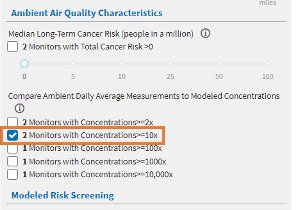
Scroll down to the Ambient Air Quality Characteristics section on the righthand side of the page. Under the 'Compare Ambient Daily Average Measurements to Modeled Concentrations', you can further adjust the map to show monitors that are 2x, 10x, 100x, 1000x, and 10,000x the modeled concentration level.
Select the 2 monitors with Concentrations >= 10x.
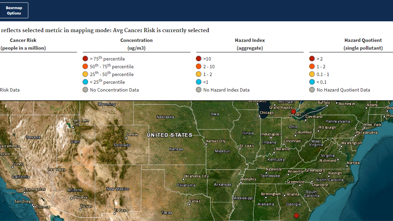
Select the Map Legend above the map to view what the colors on the map pins represent. We can see that darker colored pins represent higher measured cancer risk level, with red representing measured cancer risk greater than 100. Select a red map pin to view the monitoring station information, as well as pollutants monitored.
Look at the data in the Annual Statistics table of the Air Monitoring Station report to compare measured and modeled values.